Tools
Adobe Illustrator · Logomark sketching and vector development
Adobe InDesign · All print layout and production
Adobe Acrobat Pro · Print-ready PDF export, production preflight
Adobe Photoshop · Image direction and compositing
Canva Pro · Social media template system
Midjourney · Mood boarding and mockup visualization
Pencil and paper · Where the logo actually started
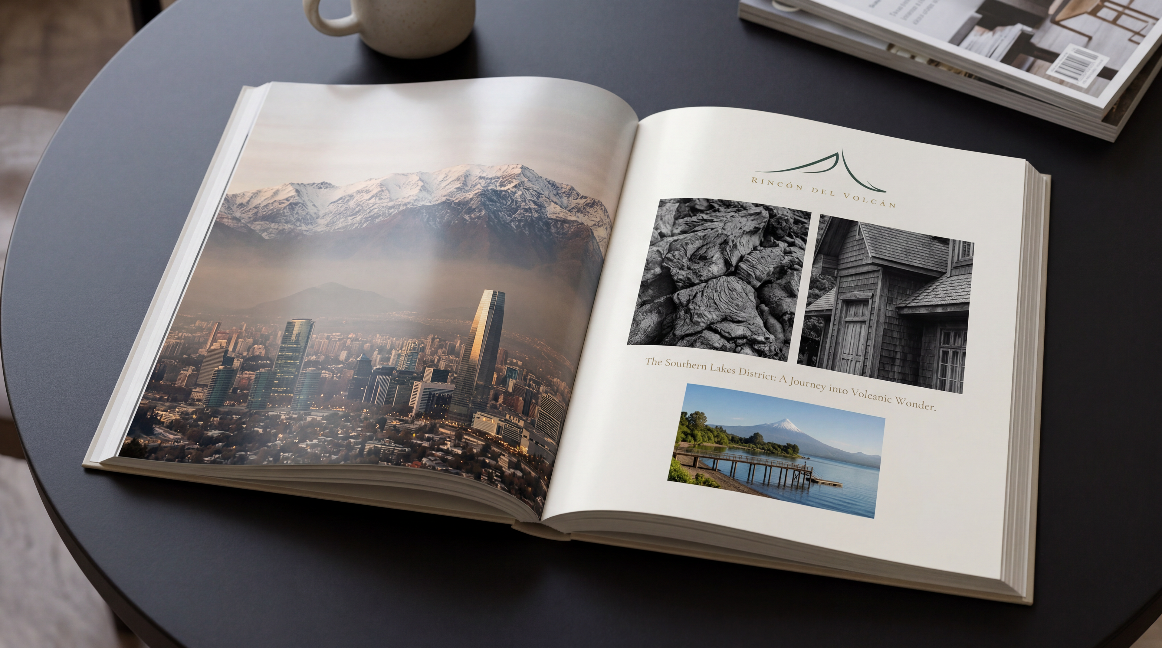
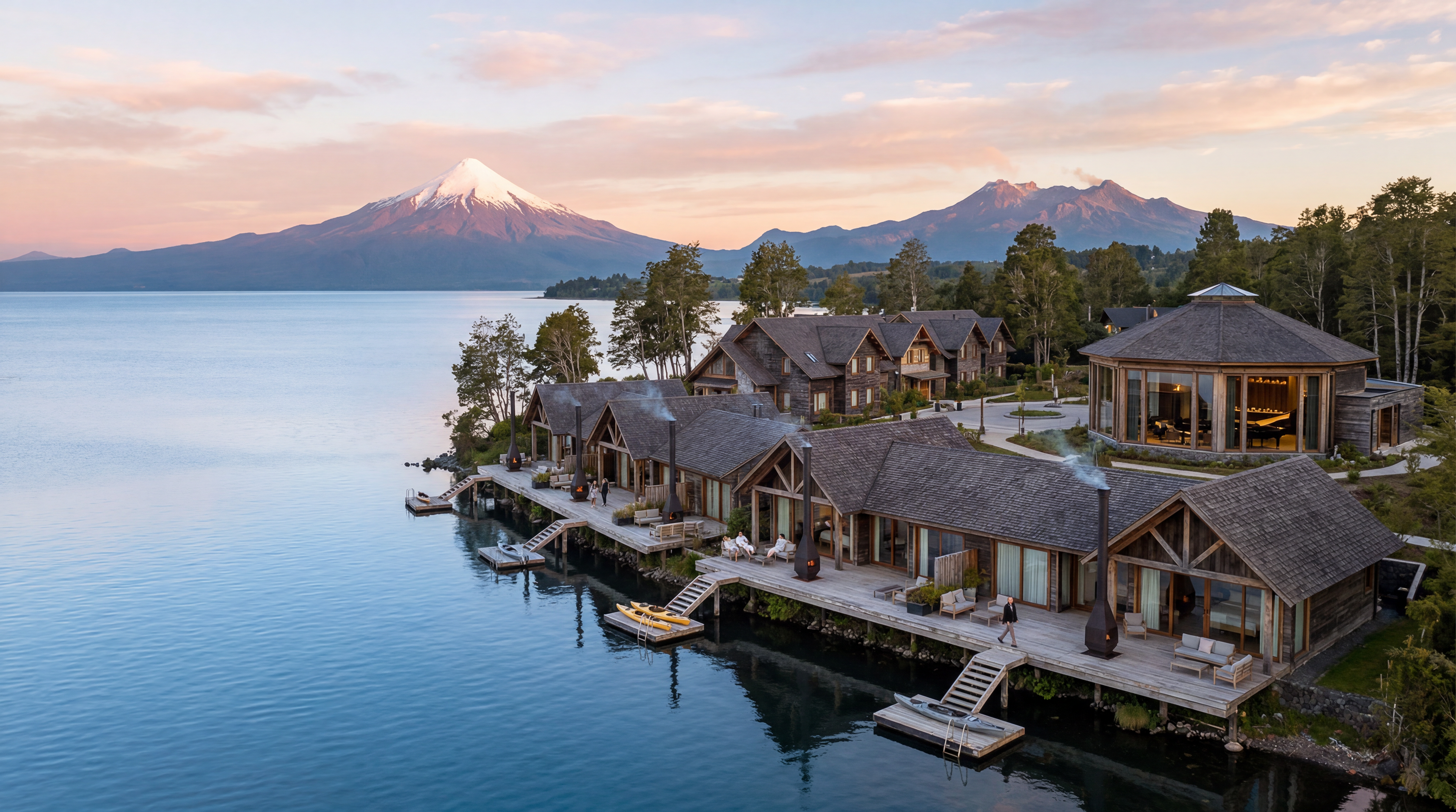
Rincón del Volcán
Brand Identity & Print Campaign
Concept branding · Print design · Identity system
Concept branding · Print design · Identity system
Frutillar, Patagonia · Chile
Rincón del Volcán began not with a client brief, but with a place.
A fictional 12-suite retreat conceived on the southern shore of Lake Llanquihue, one of South America's largest glacial lakes, set against the volcanic silhouette of Osorno, the project was an exercise in building a complete brand world from the ground up. Not a logo exercise. Not a mood board. A full identity system designed to the standard of a property that could exist, for guests who would know immediately if it didn't.
The creative foundation was the landscape itself. Frutillar is a UNESCO Creative City of Music, shaped by German-Chilean cultural heritage and anchored by the celebrated Teatro del Lago. That specificity demanded a brand that carried the weight of place without announcing it, quiet authority over borrowed aesthetic.
Identity Development
The logomark was developed using Allan Peters' noun-first methodology, a process of exhausting every obvious visual direction before arriving at the one worth keeping. The volcano, the lake, the condor, the roofline: all considered, all rejected.
The final mark emerged from the letters R and V, drawn by hand across multiple sketched iterations. The left stroke sweeps upward in a broad calligraphic arc. The right descends with a soft terminal flick. Together they read as a mountain peak, a bird in motion, and a monogram, three simultaneous readings, none of them explained. The noun it belongs to is Vaivén — the sway of a dock on still water. Both sides moving at once, balanced, alive.
The color palette was drawn directly from the landscape at dusk: seven colors named in Spanish for the terrain they came from: Volcán, Selva, Lago, Ámbar, Lino, Nieve, Lenga, each converted to precise CMYK values for print production.
Typography was set in two voices. Cormorant Garamond Light for all display and emotional work. Futura Light for all body copy and detail. A complete InDesign paragraph style system was built across seven named styles to ensure consistency across every deliverable.
Print Campaign
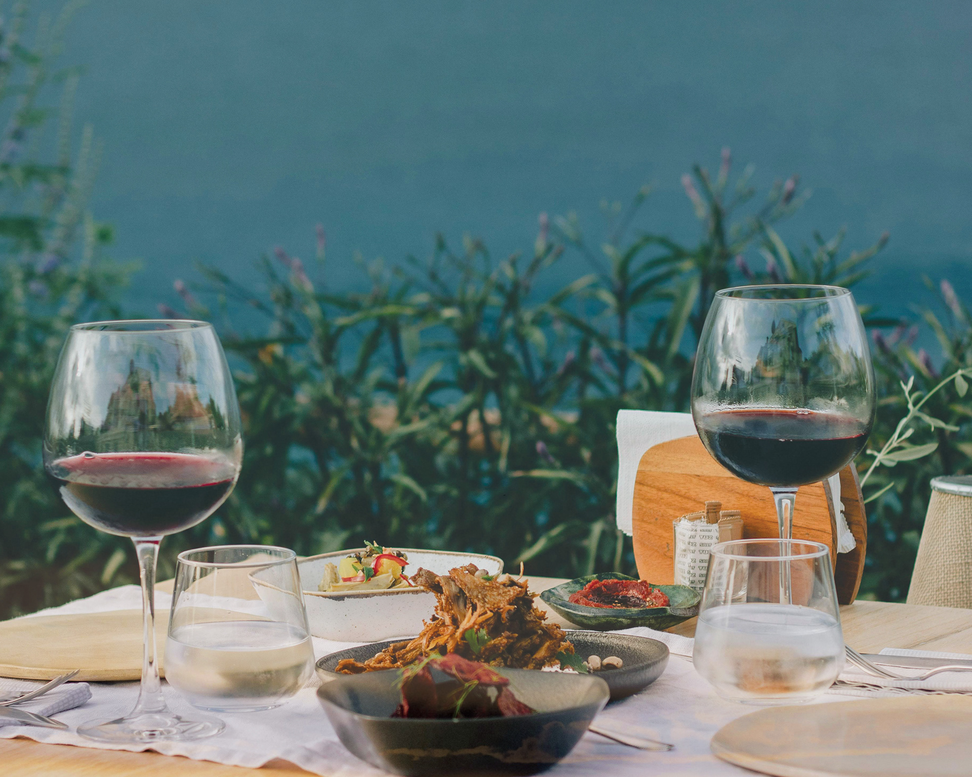
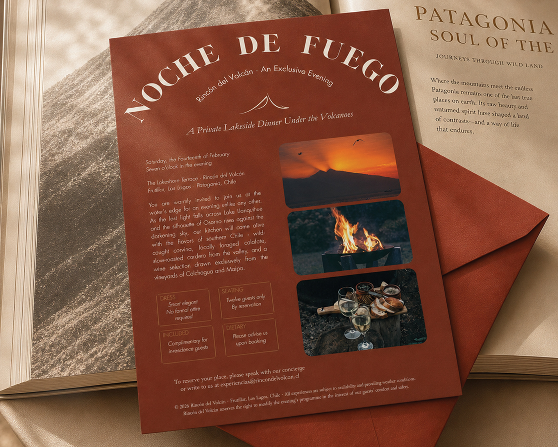
The event flyer, Noche de Fuego was written and designed as an invitation to a private lakeside dinner series. Nine copy tiers from eyebrow to legal, each with type specifications. The closing line: Twelve seats. One long table. No menu, only the evening as it unfolds.
The tri-fold brochure organized three suite tiers across six panels, Suite Lago, Suite Selva, and Suite Volcán, each with a full copy suite: headline, tagline, description, room specifications, signature guest experience, and image art direction. The inside spread was designed so visual weight and copy intensity increased left to right, mirroring the price tier. The outside panels handled logistics directions, booking process without losing the brand's register.